Have you ever wondered why some businesses seem to effortlessly attract customers and exude a vibrant energy that is contagious? It is not just about the products or services they offer. It is also about the colours they choose to surround themselves with. Welcome to the world of commercial space design, where the art of painting goes beyond aesthetics and delves into the territory of psychology.
Colour, as a powerful visual tool, has the ability to influence our emotions, behavior, and perceptions. In this blog, we will unravel the secrets behind creating visually captivating and emotionally resonant commercial spaces. Join us as we explore the science of colours and provide invaluable painting insights for businesses seeking to make a lasting impression.
Understanding the Impact of Colour on Consumer Behaviour
Before you board on the journey of transforming your commercial space, it is essential to grasp the fundamentals of colour psychology. Different colours evoke different emotions and responses, and harnessing this knowledge can significantly impact customer experience and employee productivity.
Blue for Trust and Tranquility: Blue, often associated with trust and tranquility, is an excellent choice for businesses aiming to convey reliability. From corporate offices to healthcare facilities, incorporating shades of blue can create a calming atmosphere that fosters a sense of security.
Energize with Yellow: Yellow, the colour of sunshine, exudes positivity and energy. Ideal for retail spaces and creative hubs, a splash of yellow can draw attention and create an inviting ambiance. Just be cautious not to overdo it, as excessive yellow can be overwhelming.
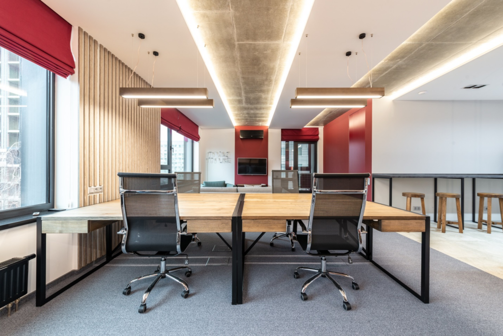
Green for Growth and Well-being: The lush greenery of Victoria’s surroundings can be mirrored within your commercial space. Green is associated with growth and well-being, making it an excellent choice for businesses in the health and wellness sector or eco-conscious ventures.
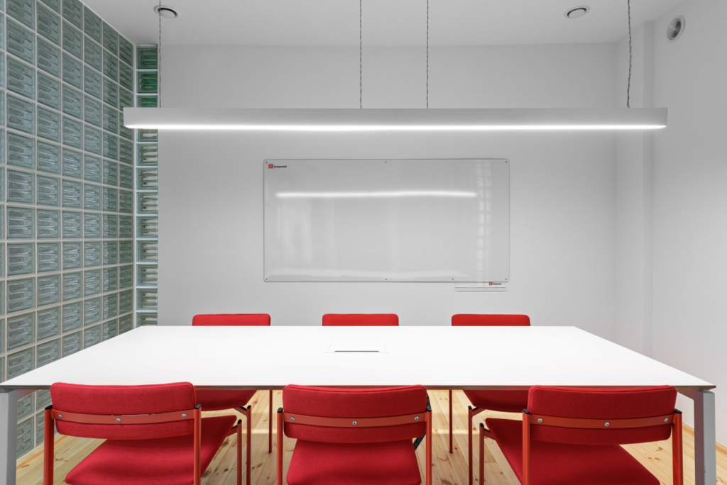
Red for Bold Statements: Want to make a bold statement? Red is your go-to colour. This vibrant hue is linked with passion, urgency, and excitement. Perfect for businesses looking to evoke strong emotions or stimulate appetite, such as restaurants or retail outlets.
Sophistication in Neutrals: For a timeless and sophisticated look, neutrals like grey, beige, or taupe are your allies. These colours create a versatile backdrop, allowing your brand elements to shine while maintaining a professional and refined aesthetic.
Harmonizing Hues with Brand Identity
While understanding the general psychology of colours is crucial, it is equally important to align your chosen palette with your brand identity. Consistency in branding, from your logo to your physical space, creates a cohesive and memorable experience for customers.
Reflecting Brand Values: Consider the values your brand stands for and select colours that reflect these principles. If your business promotes eco-friendliness, earthy tones may be the way to go. For a tech-savvy brand, modern and bold colours might be more appropriate.
Creating Visual Hierarchy: Use colour strategically to guide customers through your space. A well-thought-out colour scheme can highlight key areas, products, or services, leading to a more intuitive and engaging customer journey.
Consistency Across Platforms: Extend your colour palette consistency beyond the physical space. Ensure that the colours used in your commercial setting align with your online presence, marketing materials, and any other brand touchpoints. This harmonious approach reinforces brand recognition and strengthens the overall brand image.
Consider Cultural Significance: Recognize the cultural connotations of colours, especially in a diverse city like Victoria. Certain colours may hold different meanings in various cultures, and being mindful of these nuances ensures your brand communicates universally and avoids unintended misinterpretations.
Test and Iterate: Don’t be afraid to experiment and evolve your colour scheme over time. Market trends, customer preferences, and even your brand’s evolution may warrant adjustments. Regularly assess and gather feedback to stay attuned to your audience and keep your commercial space visually relevant.
Creating Dynamic Spaces with Colour Combinations
Now that you understand the psychological impact of colours, let’s delve into practical techniques for applying them within your commercial space.
Feature Walls: Introduce a pop of colour without overwhelming the entire space by incorporating a feature wall. This focal point can serve as a canvas for showcasing your brand colours or adding a touch of personality to the environment.
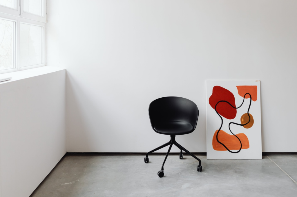
Accents and Accessories: Elevate your space with strategically placed accents and accessories. From furniture and artwork to plants and decor, these elements can tie your colour scheme together and add depth to the overall aesthetic.
Lighting Matters: The way colours appear can be greatly influenced by lighting. Natural light enhances vibrancy, while artificial lighting can create mood. Experiment with different lighting solutions to find the perfect balance for your chosen colour palette.
Consulting Professionals: When in doubt, seek the expertise of professional painters and designers. Their experience can guide you in selecting the right finishes and techniques, ensuring your vision comes to life seamlessly.
Texture and Material Selection: Beyond paint, consider the textures and materials used in your commercial space. A well-balanced colour scheme is complemented by the right mix of textures, such as matte and glossy finishes or textured walls. This adds depth and visual interest, enhancing the overall aesthetic appeal of your business environment.
Ready to transform your commercial space into a vibrant masterpiece?
Van Isle Paint, your trusted painting partner in Victoria BC, specializes in expert painting services. From harmonizing hues to expertly applying durable coatings, our team ensures enduring beauty. Elevate your interior with our personalized touch. Contact the leading painters in Victoria BC for premium commercial painting services.
Contact us for a consultation.
Sincerely,
Van Isle Paint
Victoria, BC, and Beyond
(250) 412-3885
For further insights and informative content from Van Isle Paint, please visit our blog: http://vanislepaint.com/blog/

