If you’re looking for inspiration, you’ve come to the right place! From new colour palettes to unique furniture choices, we have some fun and creative ideas to decorate your home.
Bold Patterns and Colours
Incorporate some bold colours and patterns reminiscent of the 60’s & 70’s. Green in all shades as we continue to bring the outdoors in. Try Sherwin Williams’ Evergreen Fog, a nice muted green shade. Pair this calming green shade on your walls with one feature wall with a bright and inspiring wallpaper.
Traditional Details
Nostalgia brings a sense of comfort to your home. From pattern mixing, skirted or flanged furniture, and the incorporation of antique pieces, honor the roots of interior design!
Colour-block your Wall
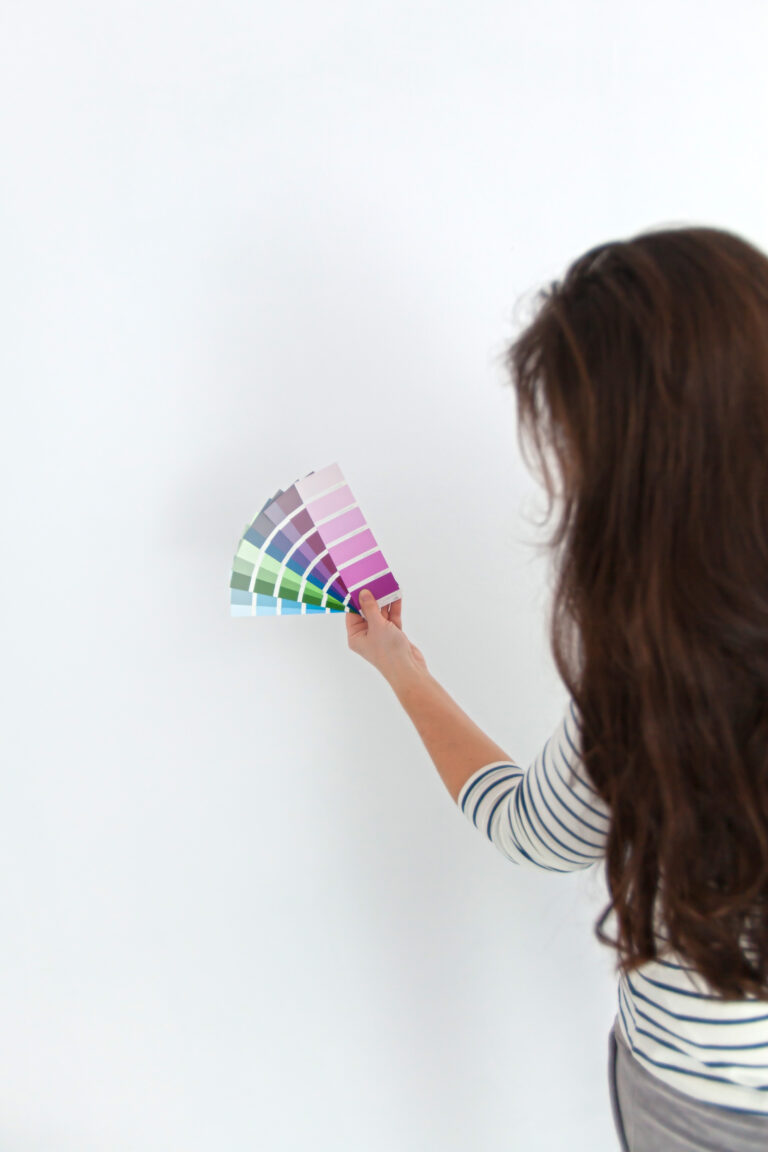
For a graphic statement, colour-block your wall. Paint half of it a bright colour, or opt for two neutral tones. Picture a black shade of paint creeping up a quarter of the wall, while the rest of the wall is a nice shade of steel grey. This creates an understated yet unique statement.
Spruce up your Entryway
Introduce a small console table to your entryway or grand foyer. For a formal, yet modern aesthetic, opt for a traditional table and hang modern abstract art above it.
3D Art
Add whimsey, intrigue, and life to flat walls. Any art that pops right off the wall, and can be configured in different ways, is a brilliant way to add a unique touch to your home.
Don’t be Affraid of Black Paint
A soft black paint colour in the bedroom makes it feel bold in special in ways that couldn’t be achieved with a light shade of paint. Pair with eclectic furniture to nicely contrast the darkness of the walls and adds a more lively, lived in, homey-feeling.
Throw Pillows
Throw pillows are the easiest way to freshen up in the bedroom or living room. Introduce a new colour, pattern, texture, or shape. A throw pillow can make the whole space feel new again. Same thing can be done with any area rug. Swap out rugs with one with more texture, brighter colours, or an inviting new pattern.
1970’s Décor
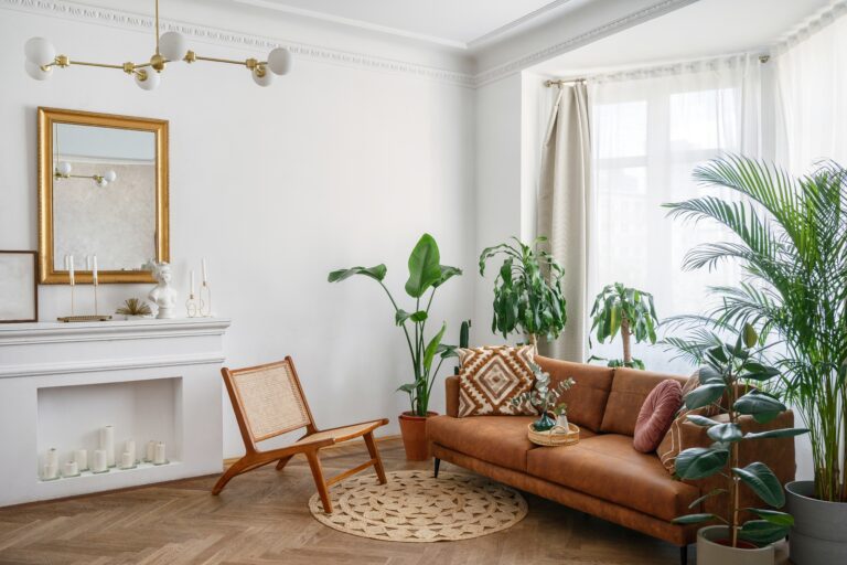
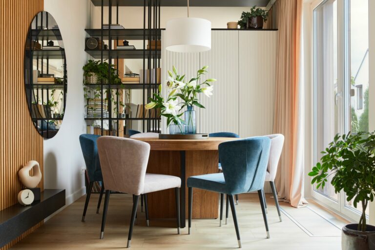
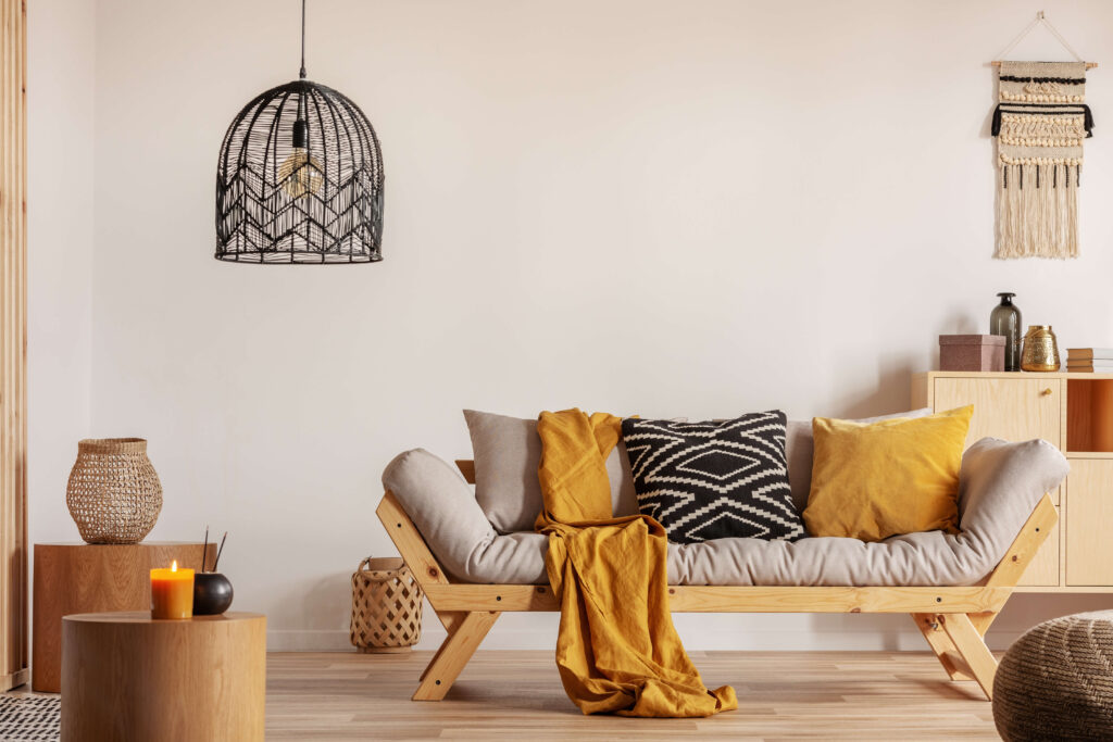
Seventies décor and colours are back! Add a pop of terracotta, sage, and mustard colour, as well as mid-century furniture trademarks. Peg legs on cabinets and tables, teak wood tones, and highly patterned fabrics.
Colourful Window Treatment
Colours and patterns are the best way to incorporate your style into your home. Window treatments play a key role within design because they are the jewelry of the room, and can really make an impact. Whether is be drapery, shades or sheers, patterns with a burst of two or three colours are the best way to add some creativity to a room.
Pantone’s Colour of the Year: Very Peri
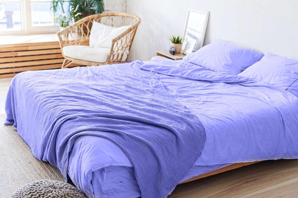
Pantone recently named 2022’s colour of the year “Very Peri” . A bold blue with a violet-red undertone. You can expect to see this shade show up anywhere from furniture to décor. Pantone describes it as “A spritely, joyous attitude and dynamic presence that encourages courageous creativity and imaginative expression”.
Sincerely,
Van Isle Paint
Victoria, BC, and Beyond
(250) 412-3885
For further insights and informative content from Van Isle Paint, please visit our blog: https://vanislepaint.com/blog/
